Wednesday, March 3, 2010

Statistical Maps

(http://personalpages.manchester.ac.uk/staff/m.dodge/cybergeography/atlas/landweber_version_16.gif)

A Statistical map portrays certain statistical information about individual countries. The statistics can be anywhere from the amount if internet (like the map above), infant mortality rate, population, precipitation, age, etc.

Propaganda maps


(http://strangemaps.files.wordpress.com/2006/11/800px-reagan-digitised-poster.JPG?w=474&h=362)

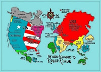
A propaganda map is a type of map that is utilized to manipulate people into think specific, and usually untrue things about a certain place. A propaganda map is often used by the government to lead people away from actually knowing definite facts, to believing false, stereotyped characteristics of a country. For example, this is a map that shows how Ronald Regan "views the world", when in reality this is just what he might have stereotyped the places to be. It shows the socialists, communists, and our oil as taking place of the actual USSR, Europe, and parts of Africa.

Planimetric Map

(http://www.squidoo.com/mapcompass)

A Planimetric map is a map that portrays horizontal features. A Planimetric map can be easily mistaken from a Topographic map; however, the main difference is that the Topographic map shows elevation, while the Planimetric shows horizontal features. Some of the features that a Planimetric map portrays are natural and geographical features and features such as rivers, parks, and roads, like in the picture above.

Topographic map

(http://www.rollanet.org/~conorw/cwome/hahatonka_topo_map.jpg)

A Topographic map is a map that utilizes contour lines to represent a phenomena. A contour line is a line that is drawn and connected at equal points of elevation. In a Topographic map, the contour lines usually portray the elevation of hills, valleys, etc.