 http://propagandica.files.wordpress.com/2008/11/circlesizeisproportionaltotheamounteachcountysleadingcandidateisahead.jpg
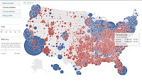
A Proportional Circle Map portrays data with the use of circles. The circles, which can be in different sizes, show information about a specific data group. This map represents the amount of propaganda Obama and McCain had on specific areas. From this map, you can tell that Obama focused in states in the north, south, and west, while McCain focused his propaganda in states in the middle of the country.
No comments:
Post a Comment