 http://www.eps.mq.edu.au/courses/GEOS219/images/deaths.jpg
Friday, April 23, 2010
Choropleth Maps
http://www.eps.mq.edu.au/courses/GEOS219/images/deaths.jpgHypsometric Maps
 http://www.msa.md.gov/megafile/msa/speccol/sc2900/sc2908/000001/000423/jpg/am423--142a.jpg
A Hypsometric map is a topographic map that portrays the different ranges of elevation with different shades of a color. The relief of an area is shaded in relevance to it's height. For example, in this topographic map of Maryland, you can see that the higher parts of elevation are located in the west of the state, because the darker the shade, the higher the elevation.
Unclassed Choropleth Maps
 http://www.agocg.ac.uk/reports/visual/casestud/dykes/figure9.gif
An Unclassed Choropleth map portrays it's data values by shading. An unclassed choropleth map does not break down the information into intervals. Instead of knowing the exact numeric data, you have to analyze the map on its shading. The darker the shading, the higher the numeric value is, and the lower the numeric value is, the softer the shading will be.
Classed Choropleth Maps
 http://my.ilstu.edu/~jrcarter/Geo204/Choro/map-AmFact-4eqint-orange-80pct.jpg
A Classed Choropleth map is a type of choropleth map that portrays information that is classified and broken down into different intervals. This map's information is classified and broken down into 4 intervals of ages.
Parallel Coordinate Graph
 http://informationandvisualization.de/files/parallel_curves_m.jpg
A parallel coordinate graph is a graph that plots all the points of data set on one single graph. By doing this, it is easy to understand and compare the distribution of data. From this parallel coordinate graph it is easy to see information about the data set for example, the highest and lowest value points .
Continuously Variable Proportional Circle Map
 http://geographyfieldwork.com/Choropleth2.gif
Black & White Aerial Photo
 http://www.flahumforms.org/FloridaDream/images/Thumbnails/1959-Destin-on-NW-Florida-C.jpg
Infrared Aerial Photo
 http://www.krisweb.com/krissheepscot/krisdb/html/krisweb/watershed/sanrafael_nasa.jpg
An Infrared aerial photo is a photo taken by Infrared Aerial Photography. An Infrared aerial photo is a photo taken off of ground level and not standing on anything (usually by plane or satellite). An Infrared film is sensitive to a particular spectrum of light. An Infrared aerial photo can be anything from photos of river deltas, roofs of buildings, the top of a rain forest and etc. An Infrared aerial photo can help educate people with problems by producing images such as the ice melting in the Arctic, the erosion of land, and problems with deforestation.
PLSS Maps
 http://www.nationalcad.org/onlineed/standard/mn-exmp2.gif
Isoline Maps
 http://www.lib.utexas.edu/maps/atlas_mexico/mean_annual_precipitaion.jpg
Bilateral Graph
 http://www.rba.gov.au/publications/bulletin/2008/feb/images/aug-twi-aus-dol-graph4.gif
A Bilateral Graph is a graph that represents more than one variable. A Bilateral Graph can be portrayed by many different types of graphs, from line graphs to bar graphs. In this Bilateral Graph, the two variables that are being compared are the Nominal TWI and ATWI are represented by a red and blue line.
Range Graded Proportional Circle Map
 http://www.neiu.edu/~jrthomas/377/circle.jpg
Bivariate Choropleth Maps
 http://proceedings.esri.com/library/userconf/proc99/proceed/papers/pap171/p1715.jpg
A Bivariate Choropleth map portrays two variables on a single map. For example, this map represents the population of 1997 (with the color) and it also represents the median house value (by the dots).
Univariate choropleth maps
 http://www.cdc.gov/pcd/issues/2007/oct/images/07_0091_02.gif
Unstandardized Choropleth Maps
 http://www.nass.usda.gov/research/atlas02/Crops/Hay%20and%20Forage%20Crops%20Harvested/Forage%20-%20Land%20Used%20for%20All%20Hay%20and%20All%20Haylage,%20Grass%20Silage,%20and%20Greenchop,%20Harvested%20Acres%202002-choropleth%20map.gif
Standardized choropleth maps
 http://upload.wikimedia.org/wikipedia/commons/thumb/7/78/USA_states_population_density_map.PNG/800px-USA_states_population_density_map.PNG
Nominal Choropleth Maps
 https://courseware.e-education.psu.edu/courses/geog482/graphics/citationexample.jpg
A Nominal Choropleth Map is a choropleth map portraying information by using nominal data. For example, this Nominal Choropleth map shows each the percent of minority groups each state has. From this map, you can see that most states have a high amount of Hispanic minority groups.
LIDAR
 http://www.wy.nrcs.usda.gov/wygis/Lidar.gif
Correlation Matrix
 http://www.kltprc.net/policynotes/Gifs/Tab_005A_4.gif
A Correlation Matrix shows the correlation between two variables. A Correlation Matrix is represented by square symmetrical (MxM). A Correlation Matrix of often used in statistics.
Similarity Matrix
 http://tomcat.esat.kuleuven.be/txtgate/images/distmat.png
A Similarity Matrix is a matrix of values that show the similarity between 2 value points. When there is a higher score, there are more similar characters and when there is a lower score, there are more different characteristics. With a higher score (more similar characteristics) there is a higher value between the two data points, and vice versa.
Population Profile
 http://www.ninis.nisra.gov.uk/mapxtreme/GFX/NI_Animated_Profile3.jpg
A Population Profile is a chart that shows the number of people in a specific area (country) in relevance with their age. A population profile can inform people about the demographics of a country. By looking at a population profile, you can see the difference is women and men with age, whether or not their is a high infant mortality rate, or if their is a high senior citizen rate. This Population Profile shows that there is a high birth rate while around the age of 30, the population seems to decrease rather rapidly. This profile also shows that there is a slightly higher birth rate of male babies.
Triangular plot
 http://www.dplot.com/triangle_plot.htm
Windrose
 http://lion.cs.uiuc.edu/projects/wsn_ornl/windrose.png
A Windrose is a tool used by meteorologists. A Windrose calculates and portrays the wind speed and direction that is distributed in a specific area. Similar to a compass, a Windrose portrays the wind direction by using the 360 degree scale and the speed by miles per second.
Lorenz Curve
 http://www.biocrawler.com/w/images/b/bd/Lorenz-curve1.png
Doppler Radar
 http://www.weatherusa.net/blog/images/doppler-orlando-1943.gif
The Doppler Radar is a radar device that utilizes the Doppler effect (the change of frequency of a wave). The Doppler Radar tracks a clouds motion, by tracking its microwave radiation and then measuring the attenuation in the return pulse. By tracking the microwave radiation, you observe and calculate the cloud's reflectivity and velocity. Doppler Radar if often utilized for tracking tornadoes.
Thursday, April 22, 2010
DRG (Digital Raster Graphic)

http://www.tceq.state.tx.us/assets/public/gis/images/drg.gif
A Digital Raster Graph portrays a topography image from the U.S. Geological Survey that has been scanned into a computer. After being scanned, a DRG still shows borders, streets, and the non flat features look as if they were flat. For example, in the DRG above, you can see the buildings in the black, the streets, and the borders of the area and the river.
DLG (Digital Line Graphs)
 http://www.dnr.sc.gov/GIS/img/beaufdlg.gif
DOQQ
 http://www.whitestar.com/images/products/doqq_tx_310.jpg
A DOQQ, also known as Digital Orthophoto Quadrangle, is a computer made image of a specific aerial photograph. The DOQQ takes the aerial image, and removes different factors affecting its clearness, such as features of topography and terrain or camera tilts. Like the DEM, the DOQQ us often utilized by the U.S. Geological Survey.
Digital Elevation Model (DEM)
 http://www.sciencegl.com/gis_dem/map_dem_gis_3d_b.jpg
Saturday, April 17, 2010
Cartogram
 http://en.wikipedia.org/wiki/File:Cartlinearlarge.png
A Cartogram is similar to a Thematic map. A Cartogram map represents a specific variable by transforming the size of an area with the size of the variable. For example, this map is showing the popular votes of the 2004 presidential elections, in which the counties have been rescaled to represent it's population.
Flow Maps
 http://www.lib.utexas.edu/maps/texas/combtrk_tx_1998.jpg
Star Plot
 http://upload.wikimedia.org/wikipedia/commons/0/09/MER_Star_Plot.gif
A Star Plot is used to portray data. Each star represents a specific value. A Star Plot is used to portray a large group of data and is created with a specific design in order to portray that information. Each distance of the stars and radius represents a specific value.
Proportional Circle Maps
 http://propagandica.files.wordpress.com/2008/11/circlesizeisproportionaltotheamounteachcountysleadingcandidateisahead.jpg
A Proportional Circle Map portrays data with the use of circles. The circles, which can be in different sizes, show information about a specific data group. This map represents the amount of propaganda Obama and McCain had on specific areas. From this map, you can tell that Obama focused in states in the north, south, and west, while McCain focused his propaganda in states in the middle of the country.
Isobar Map
 http://www.newmediastudio.org/DataDiscovery/Hurr_ED_Center/Hurr_Structure_Energetics/Closed_Isobars/Closed_Isobars_fig02.jpg
An Isobar map is a type of Contour map. An Isobar map uses isobar lines, a form of contour lines, to represent points of equal pressure. This map is often used in Meteorology.
Isotach Map
 http://www4.ncsu.edu/~nwsfo/storage/cases/20030123/small.eta_12z_300_000hr.gif
An Isotach map is a type of a contour map. An Isotach map is used to show equal points of wind sped in an area, using isotach lines, which are a form of contour lines.
Isohyetal Map
 http://www.bom.gov.au/hydro/wr/unesco/friend/pioneer/pione22.gif
An Isohyetal map is another type of Contour map. An Isohyetal map uses isohyets, a form of contour lines to represent equal points of precipitation of an area.
Isopach
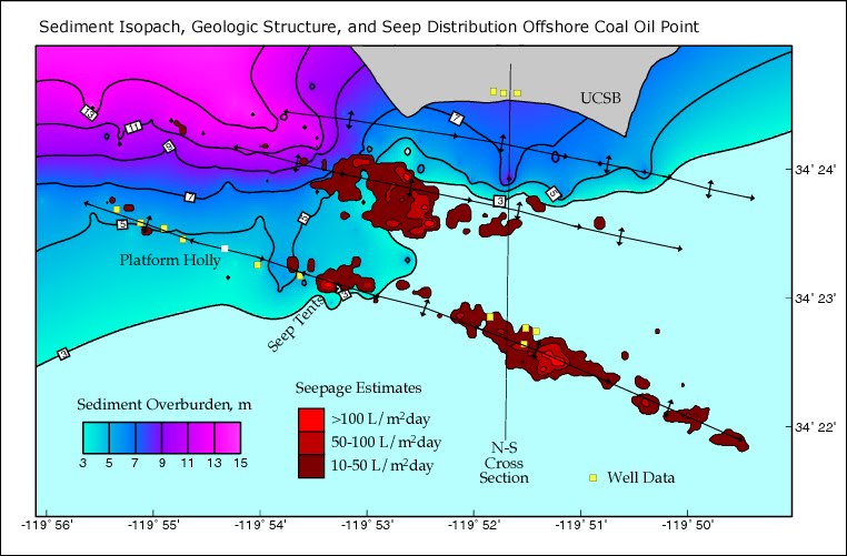 http://seeps.geol.ucsb.edu/images/pictures/geology_images/isopach.jpg
An Isopach map is a type of a contour map. An Isopach map uses isopach lines, a form of contour lines to represent the thickness of an area. These maps are often used in geology.
Histogram
 http://www.whizdog.com/qmblog/images/histogram_032005_5927_image001.gif
Box Plot
 http://edubuzz.org/blogs/nbhs3x1/files/2007/01/boxplot-2.JPG
A Box Plot is used to show the median, upper and lower quartiles, and the minimum and maximum data values of a specific data set. The box holds 50% of the data, the line within the box represents the median, and the end of the lines represent the minimum and maximum value points. This Box Plot represents the annual snow depth at a Nashville Ski Resort. From this graph, you know that the median annual snow depth is around 78, etc.
Stem and Leaf Plot
 http://mainland.cctt.org/mathsummer/JosephBond/StemAndPlots/images/table2.gif
A Stem and Leaf Plot is used to show the distribution of a data set, while giving specific information about each individual data point. A Stem and Leaf Plot graph is used to organize a large group of data. From a Stem and Leaf Plot you can receive information about the mean, median, mode, and other factors. This Stem and Leaf Plot represents the infant mortality rates in Western Africa.
Index Value Plot
 http://waterwatch.usgs.gov/regplots/real/real_tn_2.gif
An Index Value Plot represents information either being above average, average, or below a average rate. An Index Value Plot is a type of a visualization map. This Index Value Map represents Tennessee's stream flow during the years 2000-2009. It shows whether or not the stream flow was wet (above average), normal, or dry (below average).
Climograph
 http://www.uwsp.edu/geo/faculty/ritter/glossary/a_d/climograph.html
A Climograph is a graph used to portray the average monthly temperature and precipitation of a specific place. In this graph, the bars represent the precipitation while the line graph represents the temperature. This Climograph portrays the precipitation and temperature of Memphis, Tennessee.
Dot Distribution Maps
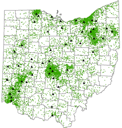 http://operationmilitarykids.ohio4h.org/resources/images/dotMap.gif
A Dot Distribution Map is often utilized to show pouplation density of a specific area. A dot distribution map can show the actual population of an area or it can portray a specific factor correlating with the population. For example, this map portrays the number of soldiers who live in different areas around the state of Ohio.
Cadastral Map
 http://www.dalisproject.org/images/cadastral_map.jpg
A Cadastral map is a map that gives information about real property. An example of a Cadastral map is a map that shows the city of Jacksonville, within the city it portrays the different parts of Jacksonville such as Orange Park or Arlington. The point of a Cadastral map is to give as much information for a particular piece of land as possible, for example tax records of the residents, zoning of the land, etc.
Subscribe to:
Posts (Atom)