 http://www.whizdog.com/qmblog/images/histogram_032005_5927_image001.gif
Saturday, April 17, 2010
Histogram
http://www.whizdog.com/qmblog/images/histogram_032005_5927_image001.gif
Box Plot
 http://edubuzz.org/blogs/nbhs3x1/files/2007/01/boxplot-2.JPG
A Box Plot is used to show the median, upper and lower quartiles, and the minimum and maximum data values of a specific data set. The box holds 50% of the data, the line within the box represents the median, and the end of the lines represent the minimum and maximum value points. This Box Plot represents the annual snow depth at a Nashville Ski Resort. From this graph, you know that the median annual snow depth is around 78, etc.
Stem and Leaf Plot
 http://mainland.cctt.org/mathsummer/JosephBond/StemAndPlots/images/table2.gif
A Stem and Leaf Plot is used to show the distribution of a data set, while giving specific information about each individual data point. A Stem and Leaf Plot graph is used to organize a large group of data. From a Stem and Leaf Plot you can receive information about the mean, median, mode, and other factors. This Stem and Leaf Plot represents the infant mortality rates in Western Africa.
Index Value Plot
 http://waterwatch.usgs.gov/regplots/real/real_tn_2.gif
An Index Value Plot represents information either being above average, average, or below a average rate. An Index Value Plot is a type of a visualization map. This Index Value Map represents Tennessee's stream flow during the years 2000-2009. It shows whether or not the stream flow was wet (above average), normal, or dry (below average).
Climograph
 http://www.uwsp.edu/geo/faculty/ritter/glossary/a_d/climograph.html
A Climograph is a graph used to portray the average monthly temperature and precipitation of a specific place. In this graph, the bars represent the precipitation while the line graph represents the temperature. This Climograph portrays the precipitation and temperature of Memphis, Tennessee.
Dot Distribution Maps
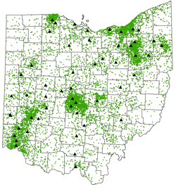 http://operationmilitarykids.ohio4h.org/resources/images/dotMap.gif
A Dot Distribution Map is often utilized to show pouplation density of a specific area. A dot distribution map can show the actual population of an area or it can portray a specific factor correlating with the population. For example, this map portrays the number of soldiers who live in different areas around the state of Ohio.
Cadastral Map
 http://www.dalisproject.org/images/cadastral_map.jpg
A Cadastral map is a map that gives information about real property. An example of a Cadastral map is a map that shows the city of Jacksonville, within the city it portrays the different parts of Jacksonville such as Orange Park or Arlington. The point of a Cadastral map is to give as much information for a particular piece of land as possible, for example tax records of the residents, zoning of the land, etc.
Subscribe to:
Posts (Atom)